Purestream
Packaging Design
Brand Identity
Logo Design
Print Design
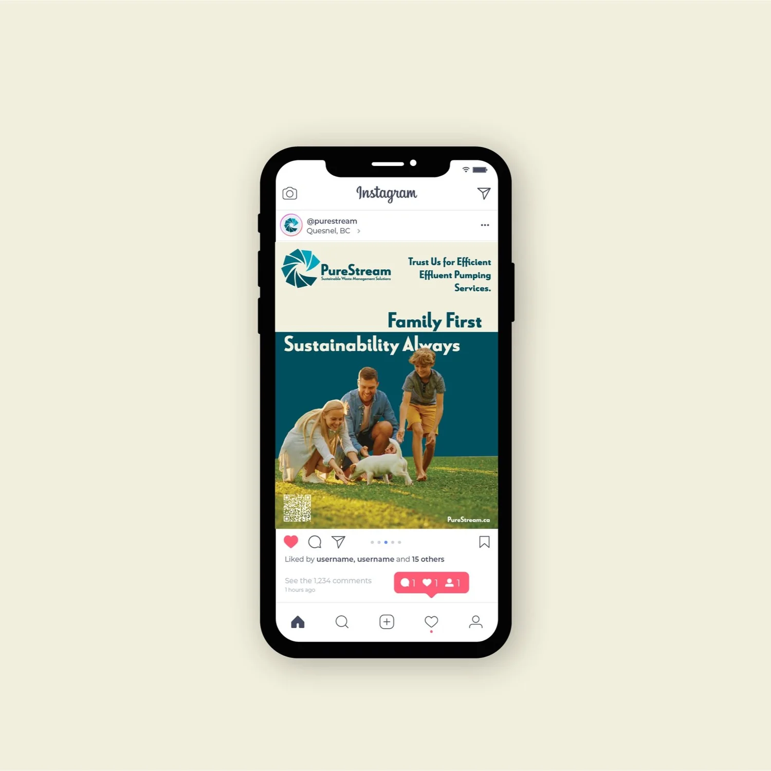
Marketing
The Logo

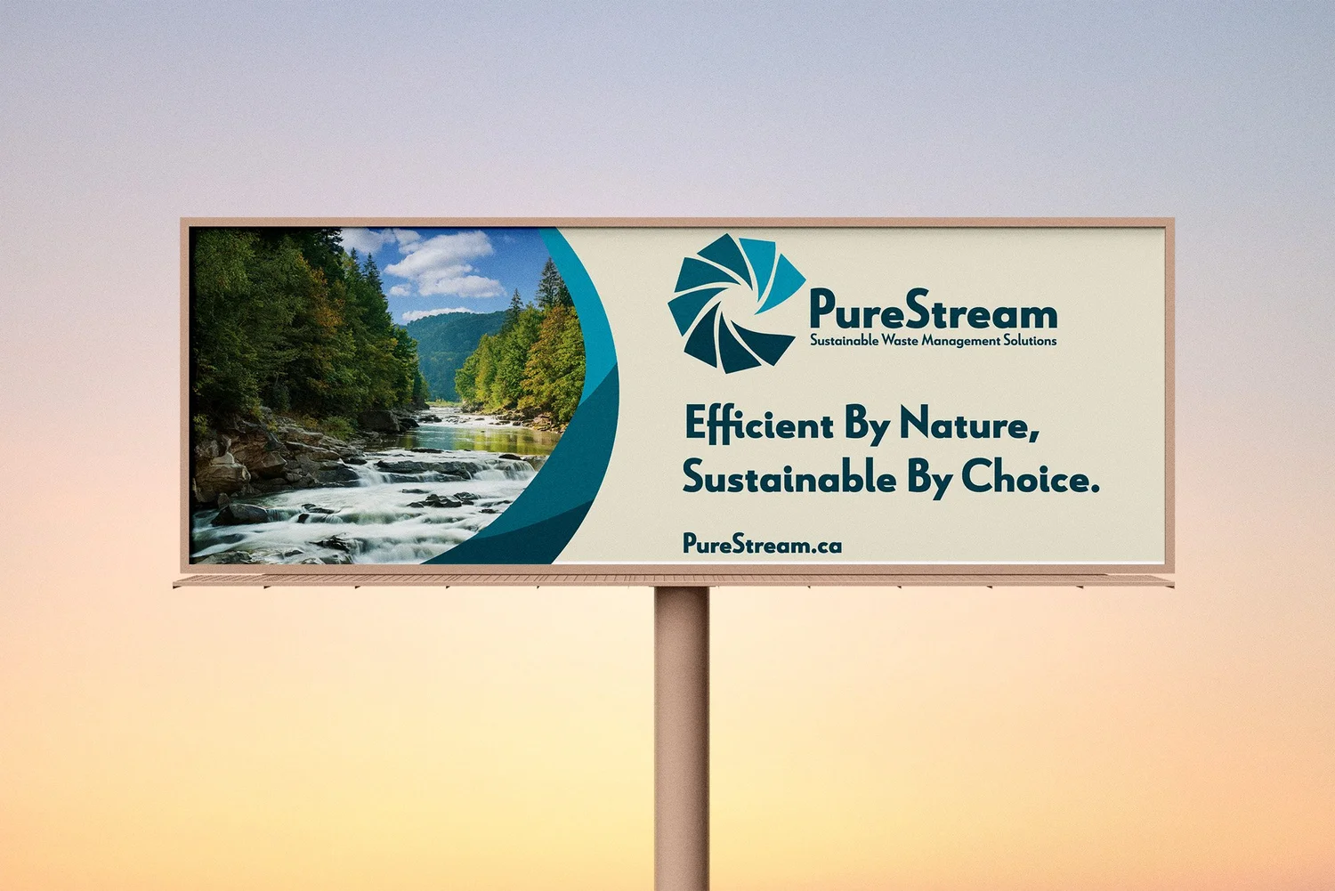
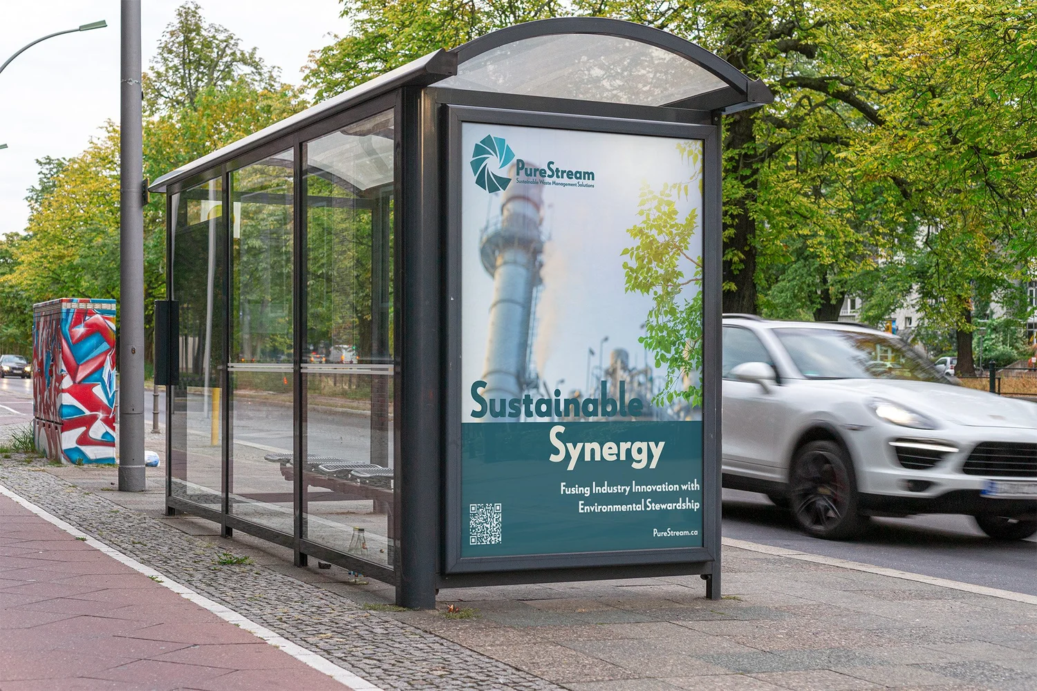
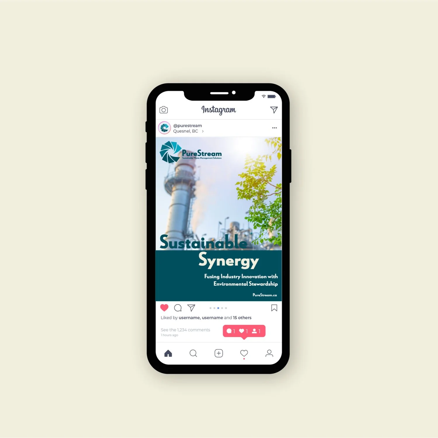
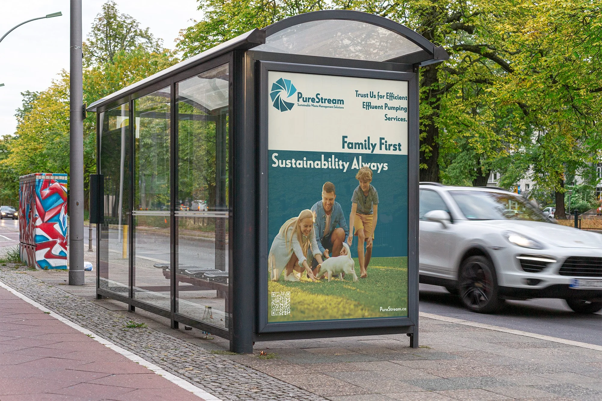
Ad Campaign
Ad's directed towards families and large businesses.
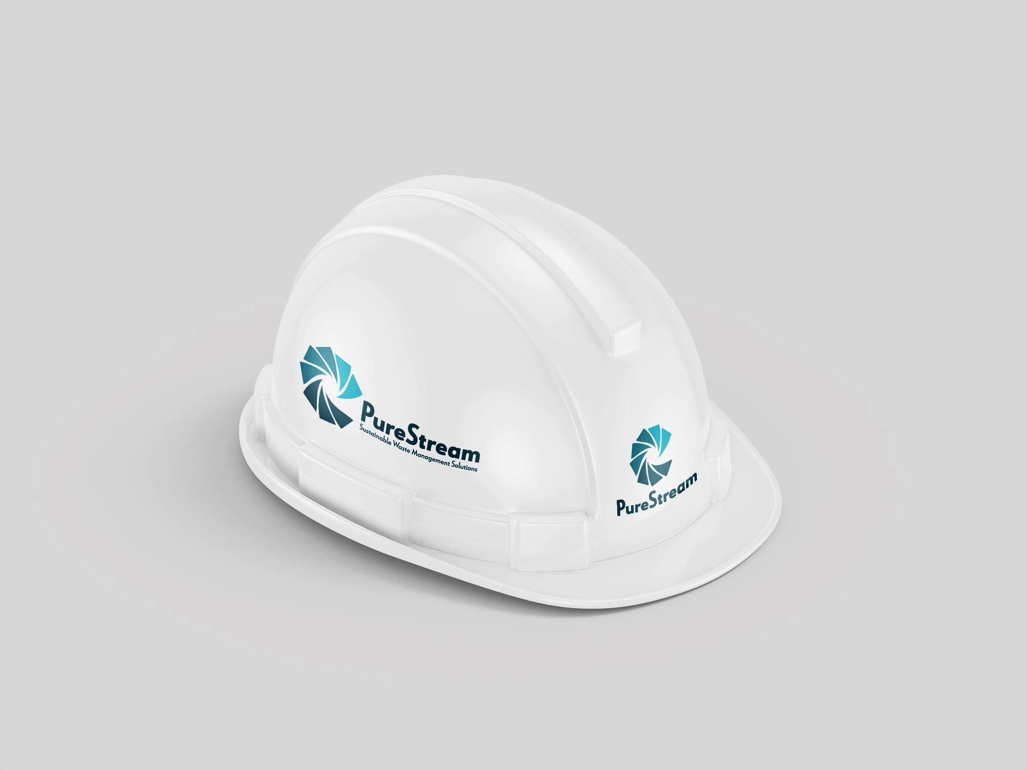
Brand Applications
The Purestream brand is applied across key operational touchpoints including a hard hat, pump truck, service van, and invoicing materials. Consistent use of clean typography and a strong, professional colour palette ensures high visibility on-site while reinforcing a reliable, industrial identity across both physical equipment and client-facing documents.


Outcome